We all know Facebook likes to tweak things, and it would appear they’re up to it again.
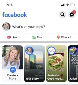
The “Create a Story” button seems to be on the move again with it appearing in a brand new spot at the top of the feed.

Our MD Meg was playing, ahem, working on Facebook and noticed the change in the formatting of the cards at the top of the mobile feed.
New icons and features are popping up on Facebook all the time.
You’ll notice the button is now a white card with text on it, taking up the bottom third of the card.
According to Andrew Hutchinson, this test has been floating around for a couple weeks but it’s the first time we’ve seen it. In previous versions the profile photo takes up the whole card.
It has also been shown where the “Create a Story” text is aligned left in the card.
Who knows what prompted this change and where the button will eventually land, ‘tis not our job to question the wisdom of the almighty Zuck and his team.


LET’S CONNECT